Colour Schemes to Help You Relax

If your life is busy and stressful have you ever thought about redecorating your home to create an environment in which it is easier to relax? There are many people who believe that colour schemes can help you do just that - the individual colours having an effect on your mood and the different shades working together to create just the right ambience.
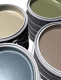
Simple Colour Schemes
The first step in creating a colour scheme to help you relax is to keep it simple. Don’t try to bring too many different colours into one room. Remember that this means considering all the objects within the space. It is no good selecting calming shades for the walls and ceiling if you then bring in harsh, clashing colours in patterned carpets, soft furnishings and printed fabrics.Light or Dark to Help You Relax?
The next question is whether to go for light or dark colours. Here, you also need to bear in mind just how you want the room to look as well as feel. There is no point creating a room entirely for your well-being if you loathe its style. You will find it hard to relax somewhere you find unappealing.Then you need to think about environments you find restful. Are you someone who finds it easier to relax when you are surrounded by light, air and space? Or are you an individual who prefers to unwind by cuddling up somewhere cosy and womb-like?
Lighter colours will certainly open up your room, giving it an illusion of expansion while darker shades will bring the walls together and may create a sense of being tucked away and warm. Clearer shades may work well for someone who enjoys being outside in the fresh air, while richer hues may be better for someone who prefers to be indoors hibernating.
Lighter Colour Schemes
Those keen to go with lighter colour schemes could try combining neutrals. Look for off-whites, antique whites and creams. Very light slate greys or whites with just a hint of very light blue or green could work too. Allow these very light colours to sit comfortably together by painting above and below picture rails, and on different walls and ceilings.If you do want to bring a little stronger colour into your space then consider it carefully. Adding a feature wall in a bold purple, red or black could well deaden the calming effect you are seeking. Try a blue, which can be calming, or perhaps a sea green or olive green.
Relax With Earthy Colours
Those keen to create a darker space can perhaps opt for more earthy tones. Bright reds, pinks, purples and oranges are known to be stimulating. They may bring warmth to a room but they are unlikely to create a restful, calming ambience.If you try toning them down, however, you might find the results more successful. To create a cosy, welcoming space in which to relax try soft clay shades, warm earthy browns and mossy greens. Keep your ceiling light, however, teaming these darker, warm hues up with cream or oaty shades above. This will prevent the room from feeling too closed in but will still retain that sense of restful retreat.
- The Stress of Building Work in My Home: A Case Study
- Creating Your Own Space at Home
- Home-Cooked Meals for Busy Households
- Dealing With the Household Chores
- Keeping on Top of DIY
- Looking After Pets
- When Household Appliances Break
- Keep a Tidy House When You Have Kids
- Do it Yourself or Pay Someone Else?
- Choosing Your Cleaning Products
- Decorating and Interior Design

Re: Can Diet Help You Deal With Stress: Interview With a Nutritionist
Hi have had food poisoning 2 weeks ago and everything is is still going through me…
Re: Am I Entitled to Any Benefits?
I just gone down to 12 hours in work I have 8 yr old daughter am separated from my husband can I claimed any benefits
Re: Am I Entitled to Any Benefits?
Hi I work 16 hrs per week I don't get any money from anywhere else I get between £139 and £169 per week I have to pay £187 per…
Re: Am I Entitled to Any Benefits?
My wife is on an average £540 I have applied for a joint assessment but told my wife earn more than the law says we need to live…
Re: Decorating and Interior Design
The secret with painting is to take care of the woodwork first. When you come to walls and ceilings, begin with the edging,…